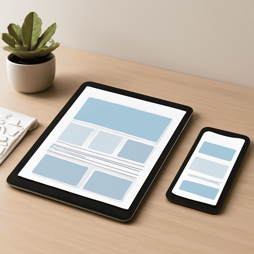
In today's digital age, ensuring a flawless browsing experience across multiple devices is crucial for any website. This is where the concept of adaptive design comes into play, ensuring that digital interfaces look great and function effortlessly, whether on a large desktop monitor or the smallest mobile screen. Let's delve into the methods and strategies for creating flexible layouts that automatically adjust to fit various screen dimensions.
Understanding Flexibility
At the heart of adaptive design is the principle of flexibility. This approach involves crafting a single layout that can morph and rearrange itself to accommodate various device sizes and orientations. The main aim is to maintain usability and aesthetic appeal regardless of the device being used.
Fluid Grids
One of the foundational techniques in this approach is the use of fluid grids. Unlike traditional pixel-based layouts, fluid grids use relative units like percentages. This means that the layout can dynamically adjust its width and reorganize its structure as the viewport size changes. By doing so, elements retain their proportional sizes, allowing for a balanced and consistent design on any device.
Media Queries
A key tool in the developer's toolkit is media queries. These are CSS techniques that enable the application of specific styles depending on the device characteristics, such as screen width, height, orientation, or resolution. By using media queries, designers can ensure that their websites change layouts or styles at predefined breakpoints, optimizing the display for various devices from tablets to wide-screen displays.
Flexible Images and Media
Just as layouts need to be adaptable, so do images and media. This technique involves setting images to a maximum width of 100% of their container, ensuring they resize rather than overflow the screen. Alongside images, videos and other media should be responsive, maintaining quality and proportion across different devices.
Touch-Friendly Interfaces
Another factor to consider is the user interaction model. Many modern devices are touch-enabled, requiring interfaces that accommodate gestures like swiping and pinching. This involves larger touch targets, adequate spacing between interactive elements, and even consideration of how hover states translate to touch experiences.
Testing Across Devices
Ensuring that your design adapts well across devices necessitates thorough testing. This involves verifying how your design behaves on actual hardware as well as using emulators and simulation tools. Testing provides insights into necessary adjustments and highlights any usability issues that may not be immediately apparent during the design phase.
Progressive Enhancement
A strategy often employed alongside responsive development is progressive enhancement. This entails building a solid foundational experience that works universally, and then enhancing it for more capable devices. By focusing first on core functionality, you guarantee a functional experience for all users, ensuring sophistication for those whose devices support advanced features.
Conclusion
Creating an adaptable digital experience is essential in today's world, where users interact with content across a myriad of devices. By understanding and applying techniques such as fluid grids, media queries, and flexible media, you can design engaging and accessible websites. This approach not only improves user satisfaction but also ensures that your digital presence remains effective, no matter how technology evolves.