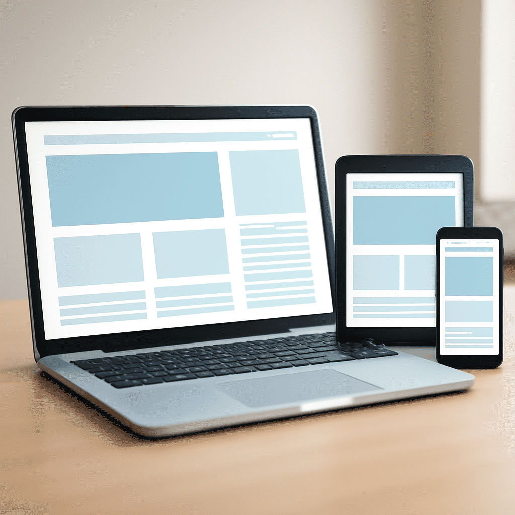
Creating layouts that respond gracefully to various devices is crucial for delivering a seamless user experience. With a diverse range of screen sizes and resolutions available today, ensuring that your design remains consistent and functional on any device is a key aspect of modern development. Here’s how you can achieve this adaptability.
Understanding the Basics
First, it’s essential to grasp the core principles of adaptable design. This involves creating a structure that can alter its appearance and behavior based on the device screen. The practice of designing these flexible structures is commonly guided by principles like fluid grids, flexible images, and media queries.
Fluid Grids
Fluid grids use relative units like percentages rather than fixed pixels to define widths, heights, and padding. This approach allows the design to stretch or shrink naturally and maintain its form across different screen sizes. By calculating dimensions in a relative fashion, you can create a versatile foundation that adapts effortlessly.
Flexible Images
Images are a pivotal part of any design, and ensuring they scale correctly is vital. Instead of setting fixed dimensions, use CSS to define maximum width (max-width: 100%), which allows images to resize according to the container they are in. This ensures that visuals remain crisp and do not overflow or distort their respective areas.
Media Queries
Media queries are a cornerstone of responsive styling. They enable the application of specific CSS rules based on the characteristics of the device, such as its width or orientation. Using breakpoints within media queries, you can tweak styles to accommodate how design elements should appear under various conditions, enhancing both aesthetics and usability.
Mobile-First Approach
Adopting a mobile-first strategy involves designing for smaller screens initially and then scaling up. This approach emphasizes the importance of core content and functionality, ensuring that nothing is lost or overlooked on smaller displays before enlarging the design to suit larger screens. This often leads to a more streamlined, efficient layout capable of expanding gracefully.
Testing Across Devices
Finally, regular testing on actual devices is indispensable. Emulators and simulators can provide an approximation, but physical testing ensures load speeds, interactivity, and viewing angles are accurately represented. Include a variety of devices and browsers to capture as many user experiences as possible to refine the end product.
Embracing adaptable layouts not only enhances usability but also optimizes the design for future devices, making it a sustainable practice in the rapidly evolving digital landscape. By combining these techniques, you can craft layouts that provide a consistent and enjoyable user experience across any device.