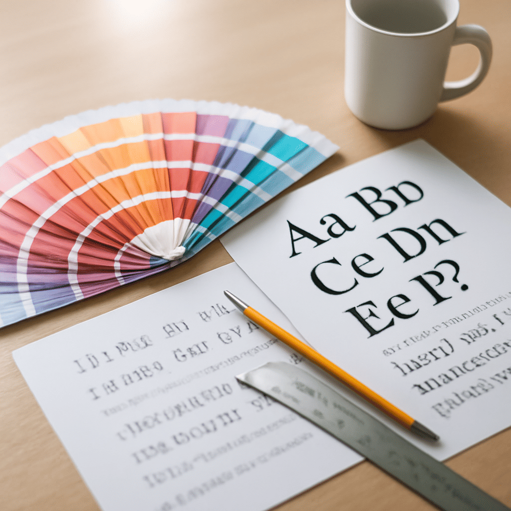
Typography and color theory are foundational elements of design that significantly influence how messages are perceived and understood. By thoughtfully combining these two elements, designers can create visuals that not only attract attention but also communicate messages effectively.
Typography: The Art of Type
Typography involves the style, arrangement, and appearance of text to convey a message. It encompasses the choice of typeface, font size, line length, spacing, and alignment. Each typographic choice affects readability, mood, and the viewer’s overall impression.
-
Typeface and Font: Typeface refers to the design of the lettering, while the font is the specific style within that typeface. Selecting the right typeface is critical in setting the tone. For example, serif typefaces are often associated with tradition and reliability, while sans-serif typefaces are viewed as modern and clean.
-
Hierarchy: Establishing a typographic hierarchy guides the reader's eyes to the most important information first. This is achieved through varying sizes, weights, and styles. Headings, subheadings, and body text help organize content and make navigation natural.
-
Readability: Ensuring that text is readable is crucial. Factors like contrast with the background, font size, and line spacing play significant roles in legibility, ensuring that the message is accessible to all viewers.
Color Theory: The Psychology of Color
Color theory involves the study of how colors interact and the emotional responses they evoke. The strategic use of color can enhance comprehension and influence perceptions.
-
Color Wheel and Harmony: The color wheel helps identify harmonious color combinations. Complementary colors (opposite on the wheel) create a vibrant look, while analogous colors (next to each other) offer a more serene and comfortable design.
-
Emotional Impact: Colors can evoke specific emotions—blue often conveys trust and calmness, while red may evoke energy and urgency. Understanding these associations helps designers choose colors that align with the intended message.
-
Contrast and Accessibility: Ensuring sufficient contrast between text and background colors is vital for readability. Additionally, considering color blindness and ensuring accessibility can make content inclusive, allowing it to reach a wider audience.
Integrating Typography and Color
Harmonizing typography with color amplifies the effectiveness of a design. Here are a few ways to achieve this:
-
Consistency: Establishing a consistent typographic pattern and color palette creates a cohesive look, strengthening brand identity and improving user experience.
-
Mood Setting: Both typography and color can set the mood. A playful combination might involve bright colors with a whimsical typeface, while a professional look might use muted tones with formal fonts.
-
Contrast and Emphasis: Strategically using contrasting colors with bold typography can highlight key information, ensuring it stands out to the viewer.
In conclusion, typography and color theory are more than mere aesthetic choices. They are powerful tools that, when used together effectively, can create strong visual messages and enhance communication. By understanding and applying the principles of both, designers can craft works that resonate deeply and convey messages with clarity and impact.